Artwork Blog
Final 2
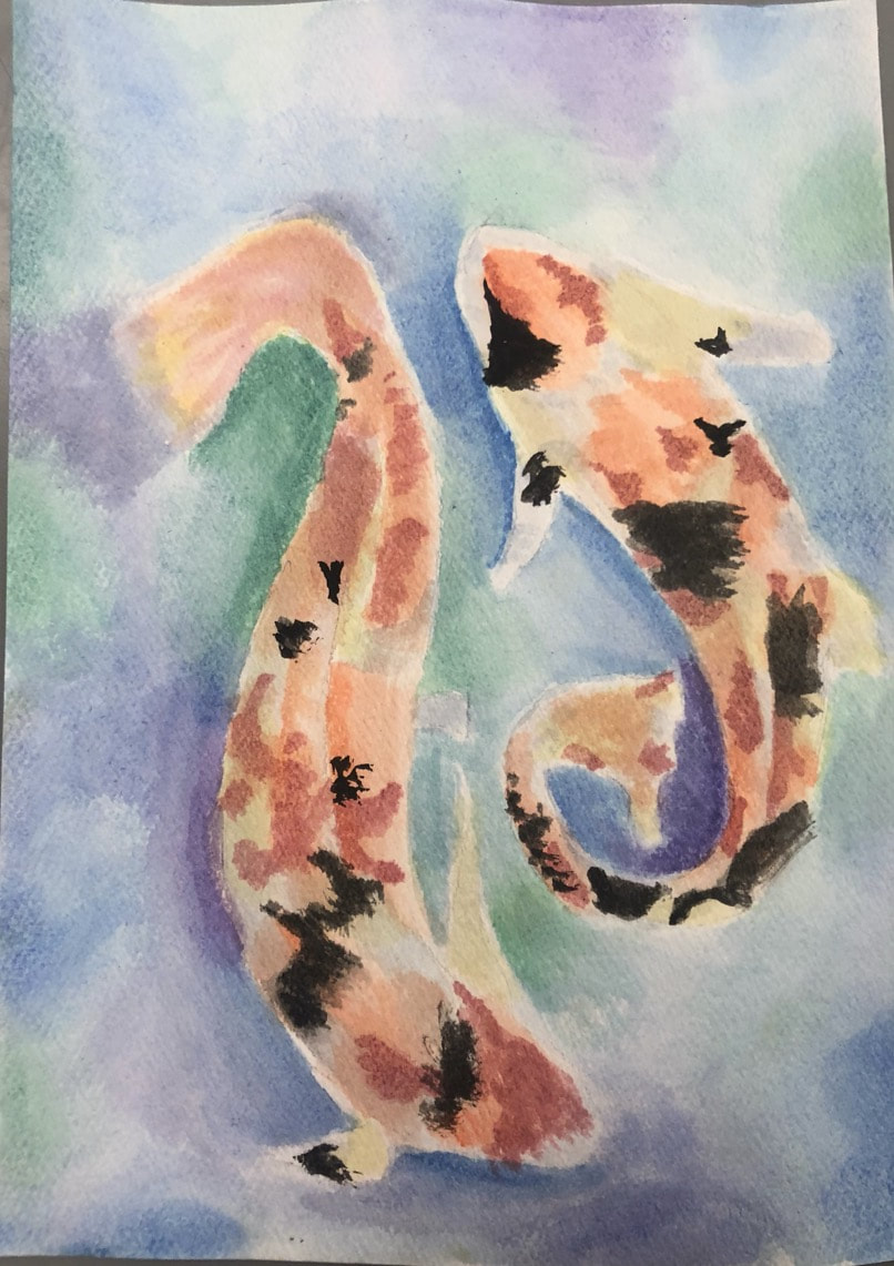
This is my second final, a water color of koi fish on an approximately 9 x 7 watercolor paper. Doing this painting helped me improve my ability to use water colors and plan my placement of colors in advance. In my painting I used the art element of value by adding more paint and brighter color to create a shadow the the left of the fish. I used the design element of unity/harmony by creating the 2 koi fish to try and represent a ying yang and or balance. I honestly created this because sadly I didn’t have enough to time to complete the other painting and I’ve always wanted to paint koi fish.
Final 1
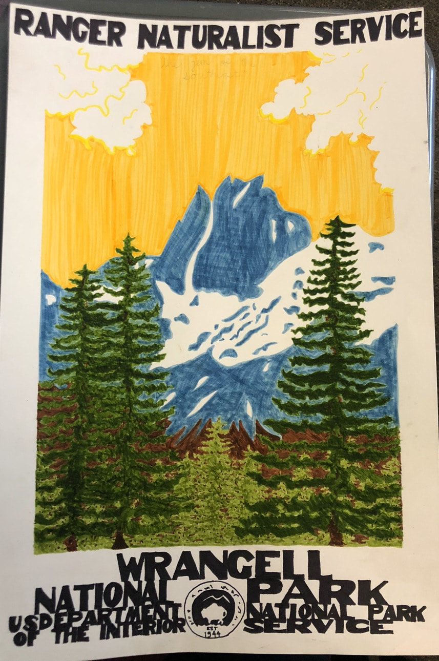
This is my first final of Wrangell, Alaska’s inspired by wpa posters. Doing this drawing helped me improve my technique with markers and frustratingly enough, my spacing of letters. In the poster I used the art element of color to show the different structures such as the mountains, trees, snow, etc. By using color, it also helped me use the design element of emphasis, by emphasizing the structures in their whole shape and helping to differentiate what structures were closer or farther away. I created this as a gift to my brother and to push myself to try something new.
Portrait
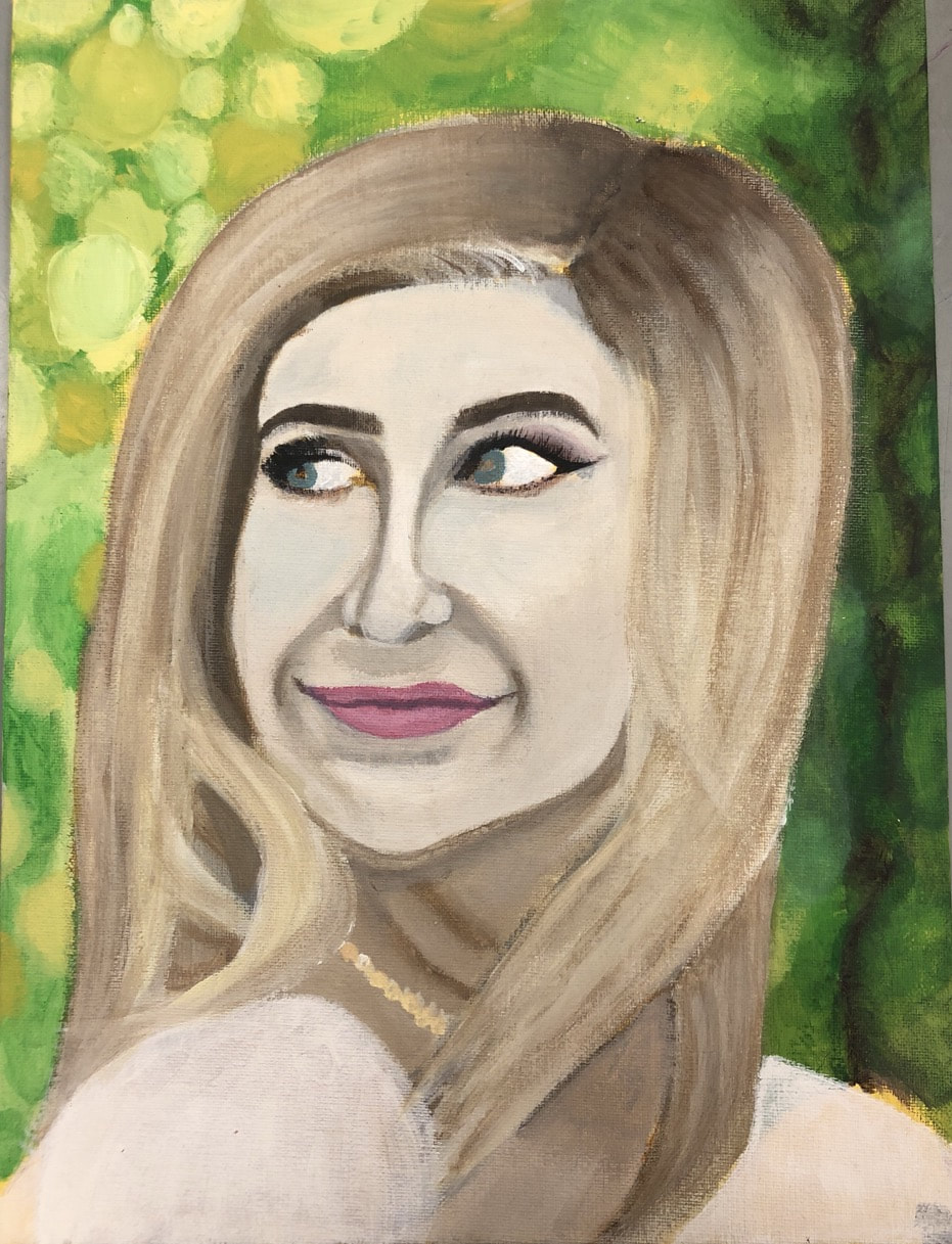
This is my self portrait on a 12 x 16 canvas based off of one of my senior pictures. Doing the self portrait definitely helped improve my ability to figure out placement of facial features when a head is turned. In the portrait I used the art elements of value and color. I used the color to create the values on my face by using a darker color for shadows, then using lighter colors to accentuate the highlights of my face. I used the design element of proportion to create even and realistic features as shown in the original photo. I created this to try and become more comfortable with portraits and understanding that they will not be perfect (especially on my second one).
Block Print
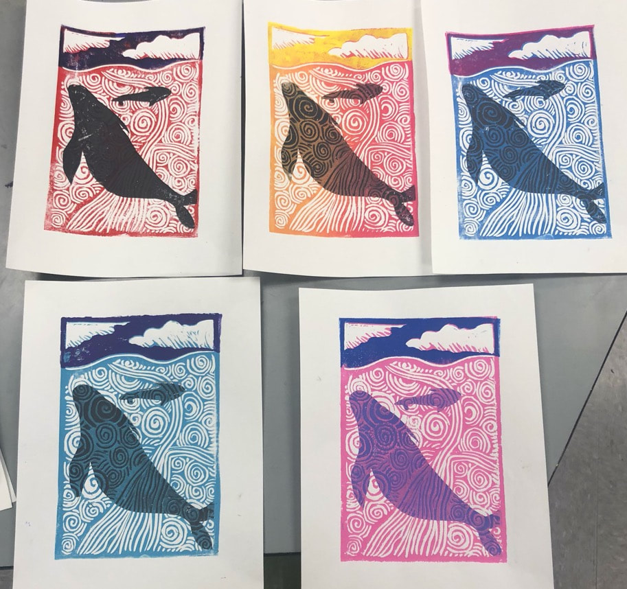
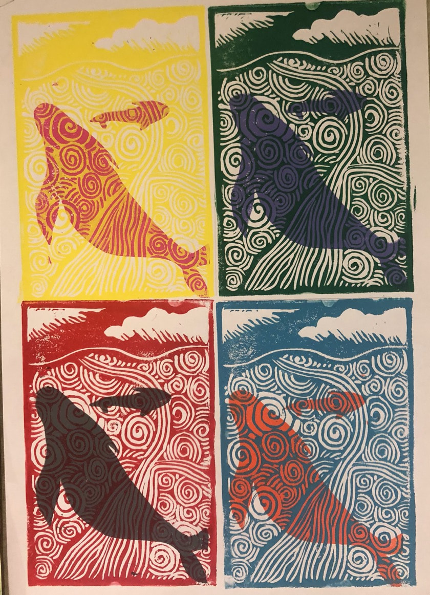
These are my block prints of whales in the ocean on a 6 x 9 linoleum block. Doing the block prints definitely helped improve my ability to carve out my block with distinct purpose and order of doing so. In the prints I used the art elements of value and color. I used the color to create the values on the print by using a darker color for the first print of the whale, then using lighter colors over the whale to give the illusion that the whale is underwater. I used the design element of proportion and scale by making one whale much smaller than the other to show that it is farther away. I created this to try and become more comfortable with the order of block printing and carving things out.
Pen and Ink
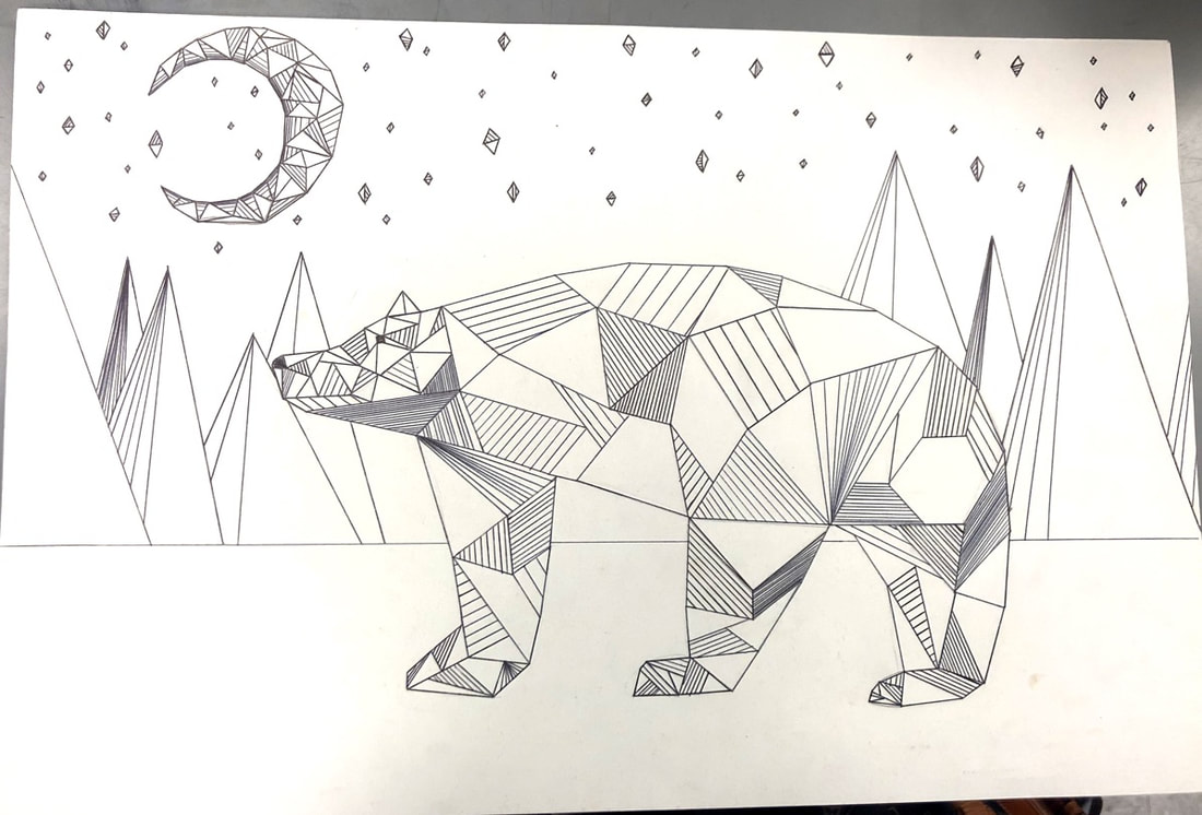
This is my Pen and Ink drawing of a GRIZZLY bear on a 12 x 18. Doing this drawing helped improve my ability to work with 3 dimensional shapes. In the drawing I used the art element of lines. The lines were used to help accentuate the geometric shapes that form the grizzly bear. I used the design element of emphasis by using specific shapes and lines to emphasize the body parts of the bear and to emphasize the shadows of the trees. I created this to try and gain better skill of visualizing my ideas before I draw them out.
 RSS Feed
